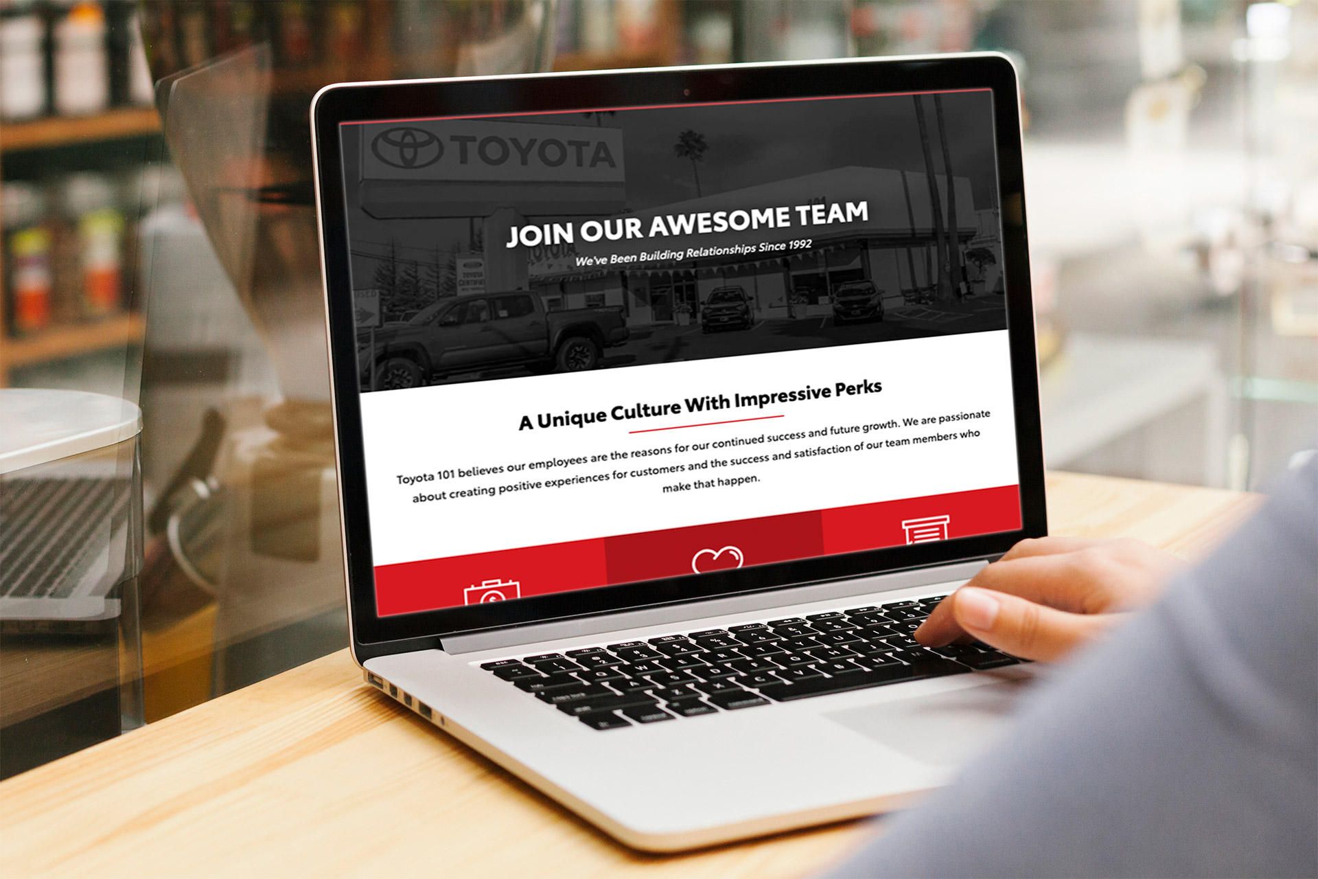
Landing Page Refresh

In 2017 a fellow designer created this "Join Our Team" landing page using responsive code. Although it was a step in the right direction and layout‑wise looked great on desktop, in 2019 I revisited the page to implement newer UX/UI practices, starting with a mobile‑first mentality.
My Role: Digital Designer, UX/UI Designer, Web Developer
Skills Practiced: Collaboration, Sketching, Wireframing, UX Design, Coding
Tools: Pencil & Graph Paper, Adobe Photoshop, Adobe Dreamweaver
Dynamic Beacon / July 2019
Light Gray
HEX: #E3E3E3
RGB: 227, 227, 227
Dark Gray
HEX: #2B2B2B
RGB: 43, 43, 43
Black
HEX: #000000
RGB: 0, 0, 0
White
HEX: #FFFFFF
RGB: 255, 255, 255
Red
HEX: #D71920
RGB: 215, 25, 32
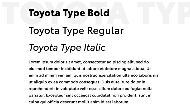
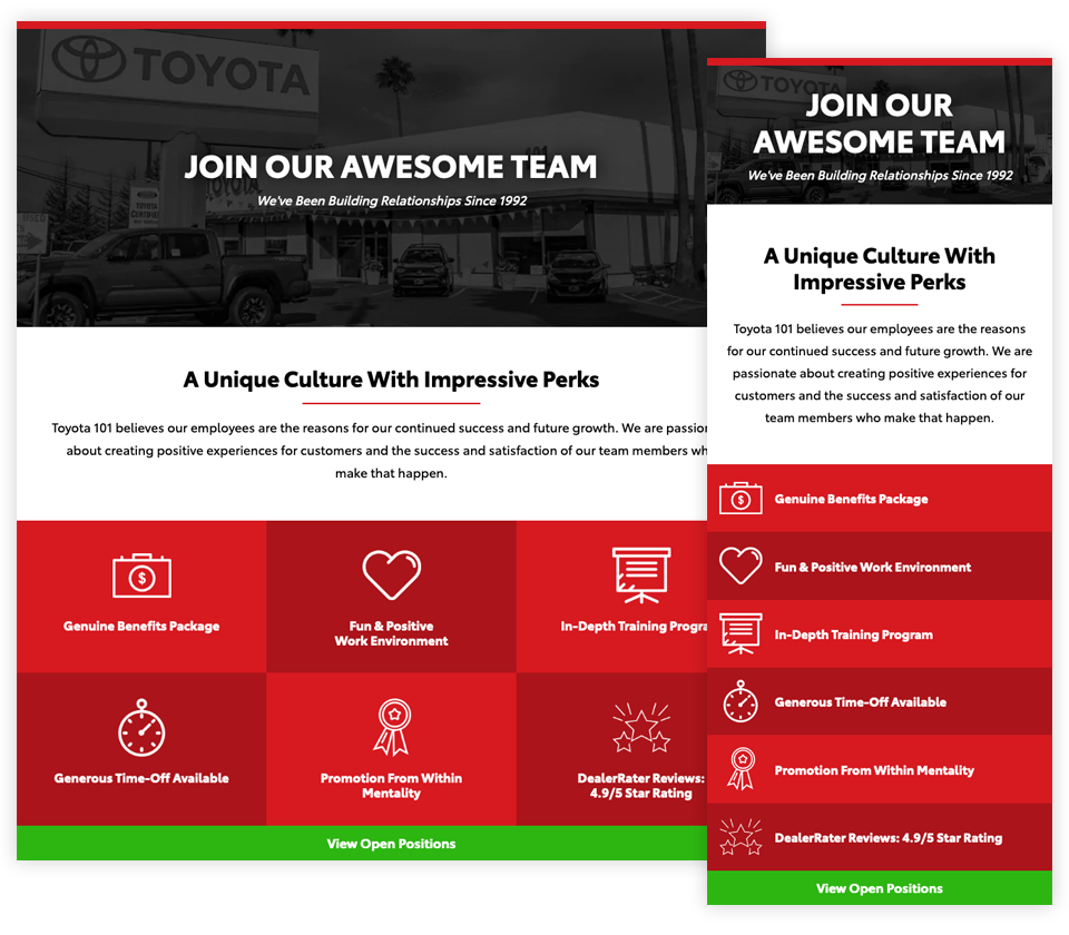
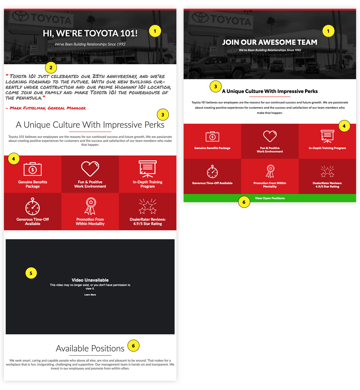
Hero background image height increased to reveal dealership
Having a testimonial gave the page a personal touch but the hand‑written typeface made it tough to read. For legibility purposes, the testimonial image block was removed.
The hierarchy of the older page shared the same level of importance throughout most of its sections. By applying smaller header‑tags and increasing the line‑heights, more white space was created.
The icons in this subsection were disproportionate. Without enough breathing room around each block, it seemed crowded. I downsized the icons but kept the copy consistent with other paragraph sizing.
A short YouTube video about the dealership had been previously added to the page. When the original video was taken down from its channel it caused a broken link. Without a replacement video it only made sense to remove the section completely.
For a page encouraging people to 'Join The Team', there wasn't much information available about currently open positions. For people with interest, a call to action (CTA) was added to the bottom of the page linking to a form.
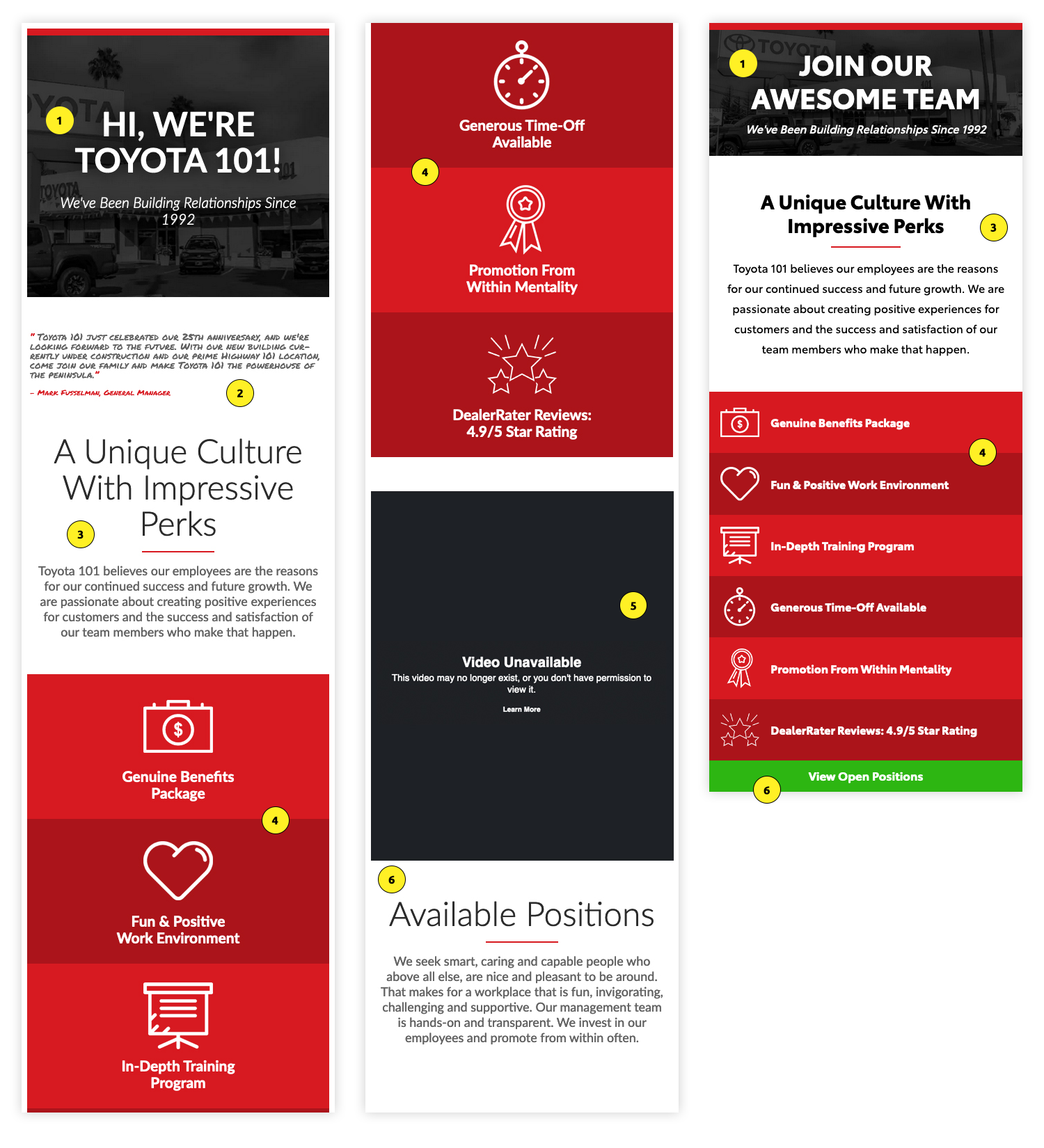
Hero background image height decreased to bring up page content.
Testimonial image block completely removed due to legibility issues.
Smaller header‑tag applied to section title, so it fits neatly on two lines. An increased line‑height makes the paragraph copy more breathable.
To prevent unnecessary scrolling, block items were reformatted with an icon beside the content in a one‑sixth/five‑sixth grid layout rather than stacked single file.
Video content removed
A full‑width button was added, linking to a form. An increased touch‑point area makes it easier for people to click‑through, leading to better conversions.
